Orchestrated Energy
Acquisition & Enrollment
Empowering marketing teams & engaging customers
Orchestrated Energy, a program that optimizes residential HVAC runtime during summer months by integrating with smart thermostats, was a product without an acquisition plan. Historically, product marketing was the responsibility of our utility clients. However, they struggled with the nuances of the product and had difficulty describing it in a meaningful way.
Between the Summer of 2018 and Spring of 2019, I was part of a cross-functional team of product management, marketing and engineering that developed a highly configurable, white-labeled acquisition and enrollment site.
Accomplishments
Increased conversions
Through 2018-2019, we increased the conversion rate to 40%.
More educated users
During testing and interviews, users could easily explain in their own words how the program worked.
Reduced usability barriers
We implemented changes to our mobile form experience to reduce friction for nearly 40% of our traffic.Highly configurable solution
Utility clients were delighted to have a more broadly appealing design to implement. We were happy to have the ability to launch and update content as needed without developers.
Keep reading to see how we did it...
Challenges & Objectives
OE was serving a handful of utilities at this time. Each utility had a unique program design, which necessitated a flexible solution. On top of that, each had their own brand, which meant the overall design would need to be able to serve multiple style guides.
Technically speaking, the enrollment process was not easy. We needed a way to verify that enrollees were actually eligible for the program as part of compliance with regulatory filings. Connecting Orchestrated energy to smart thermostats also meant the user was required to log into their thermostat accounts to authorize permission. This increased the barrier to entry since not all customers have login credentials readily available, nor are they always willing to allow a third party product access to their data.
Lastly, we learned through our research that customers had a difficult time understanding what the program was. They were confused about how it would operate in their home. Our utility partners had seen a <1% conversion rate on their comparable digital enrollment solution and they were looking to us for help.
Goals
1. Increase our conversion rate substantially
2. Build a white-labeled, easily configurable enrollment site to serve our utility customers
3. Ensure users understand the program they are signing up for
My Role
During my time on the team, I helped to advocate for potential customers by leaning on previous user research. I collaborated closely with marketing experts to help develop a content strategy. I worked with product management to help inform experience requirements. I consulted with engineers on feasibility and to guide execution.
My day-to-day responsibilities included user flows, wireframing, prototyping, workshop facilitation, UI design and user testing.
Kick-off & initials concepts
At the onset of the project, the product manager, myself and the marketing manager met to discuss previous research and whiteboard potential solutions. At the same time, value proposition surveys were conducted to help refine the way we talk about OE with users. With a solid concept, I began to map out the flow and wireframe the site while the marketing manager began to produce content.
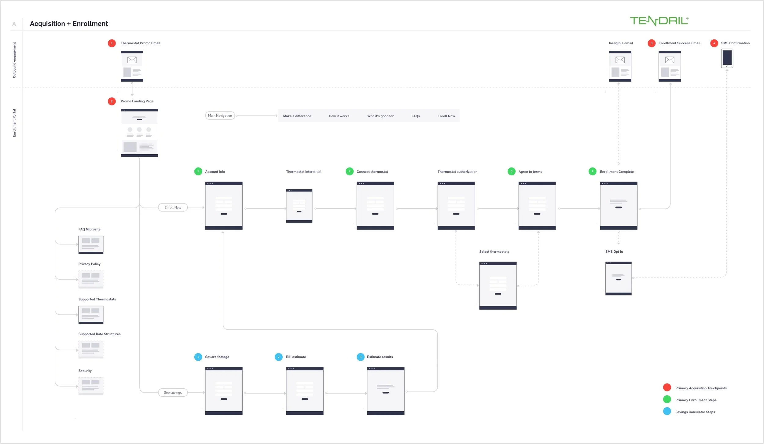
Early user flow for the enrollment site
Our initial concept took what was formerly a nine step enrollment process through our utility partner’s site and reduced it to four. One of the steps included an email verification half-way through the enrollment flow. However, during user testing we saw that most users abandoned the enrollment at this point because the believed they had completed it. They were used to an email verification step signaling the end of a sign-up process. By showing the outcome to stakeholders, we were also able to remove this step, simplifying enrollment even further.
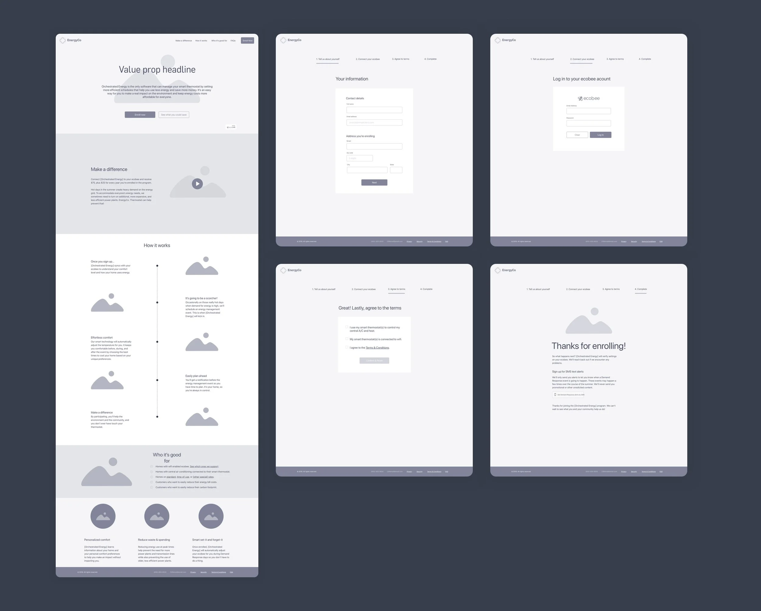
Initial wireframes for the enrollment site
The wireframes were then passed off to a UI designer, who I collaborated with to ensure their design aligned with the spirit of the wireframe. He oversaw the execution with the development team and the first iteration launched in Summer of 2018.
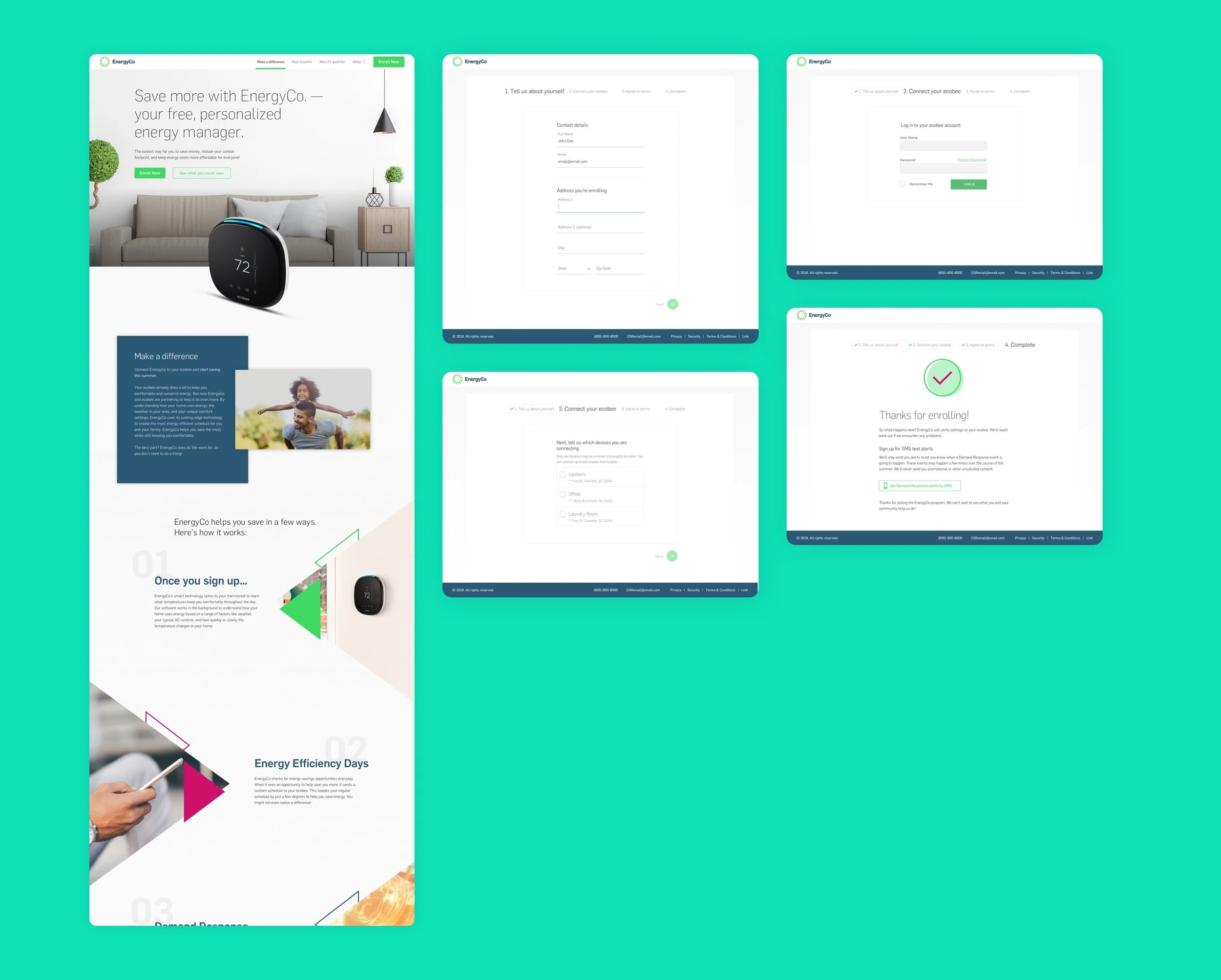
Early UI work done by our UI designer
Research Insights
Through a combination of data analytics and user interviews, we were able to understand how the enrollment site was performing that summer.
Information was competing for attention
We had originally designed the page with a savings calculator tool, both as a fun engagement strategy and as a way to demonstrate the value of the product to the user. Overall engagement with the tool was low, however, and likely just competing for the user’s attention
Users still struggled with the product concept
When asked in interviews to describe the product in their own words, most had a difficult time doing so. We knew we still had work to do to accurately market the program.
40% of our traffic was mobile
This is not a surprising number, but it was an important number for us to have in order to persuade key stakeholders that we needed to better optimize for mobile. Our solution was already responsive, but enhancements to the enrollment forms had not been implemented due to time restrictions.
Iteration
In the next phase of design, I saw the site through from start to finish, meaning I was also responsible for the UI design and overseeing the engineering execution. As I began to streamline design, it was becoming apparent that enrollment was becoming even more complex on the backend. We now had additional marketing partners that were fulfilling a rebate-like component to a new offer.

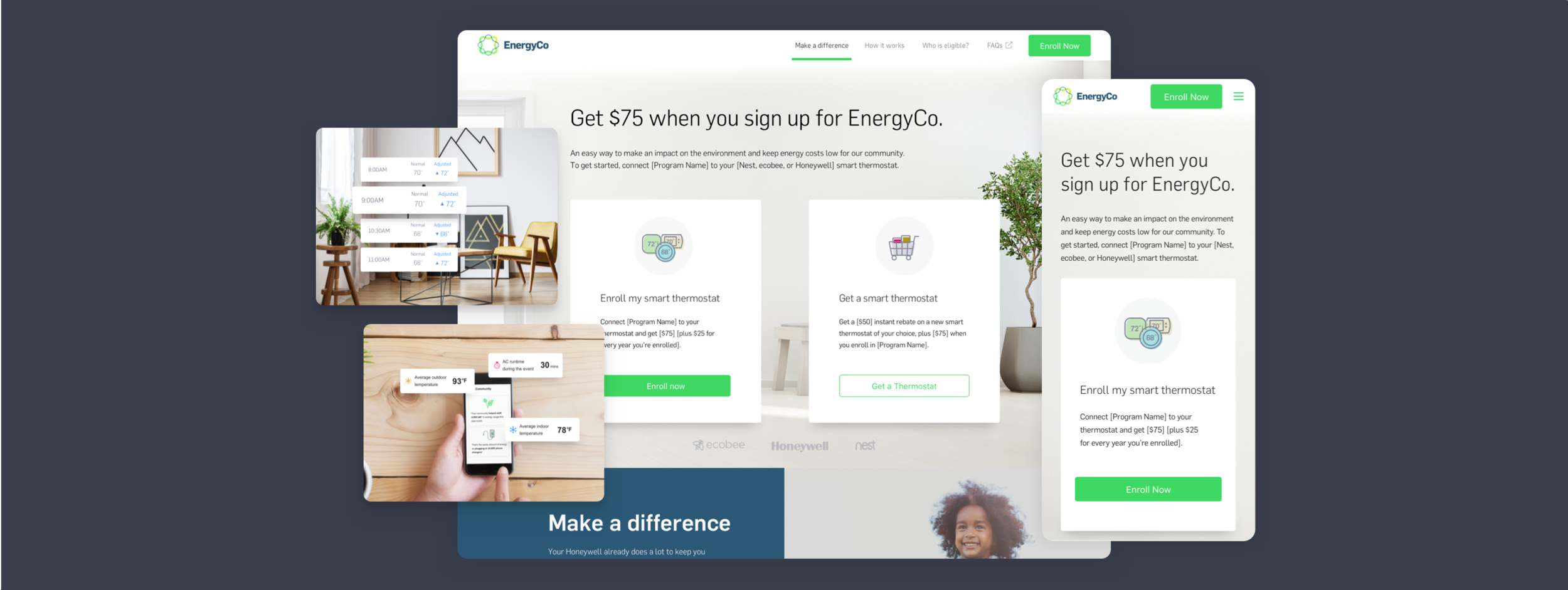
Updated acquisition flow. Some data has been intentionally omitted.
While our marketing manager worked to revise and update content, I worked to design a new site that would eliminate the less used features from the first iteration and incorporate our new partners into the mix. At the same time, we heard from our utility clients that the initial design felt too far removed from their brands, so I made it more generic and appealing to a broader audience. Engineering was also working toward integrating a CMS that would enable the marketing team to customize content as needed for multi-variate testing.
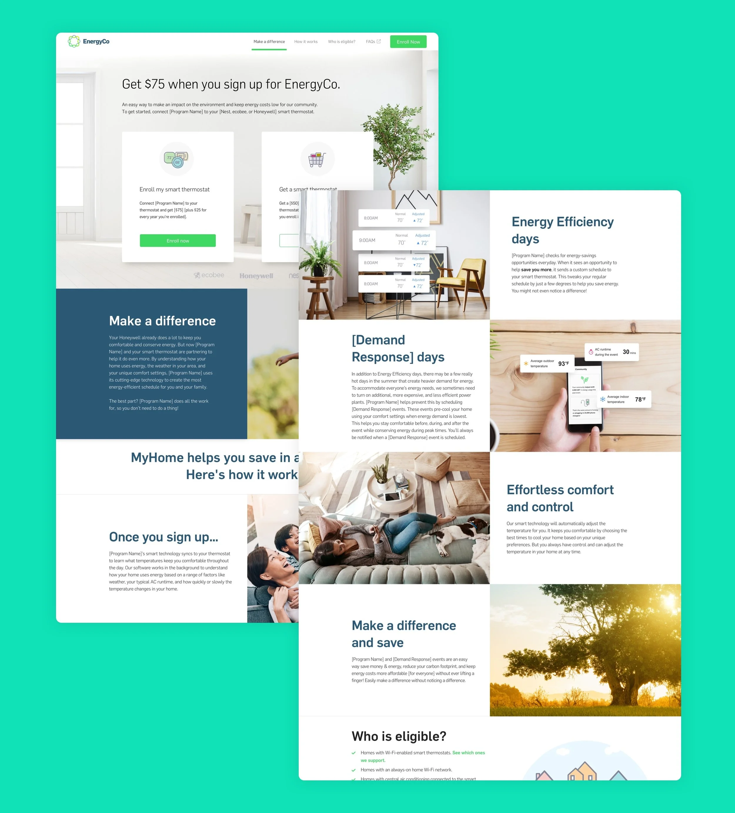
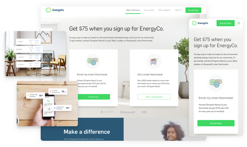
The final design I put together for the enrollment site
Lastly, I worked with product management to develop requirements to enhance the mobile experience, primarily in the enrollment forms. I collaborated with engineering to implement native input keyboards, improve error handling to be visible on the viewport and enabling navigation to subsequent fields by tapping ‘done’.
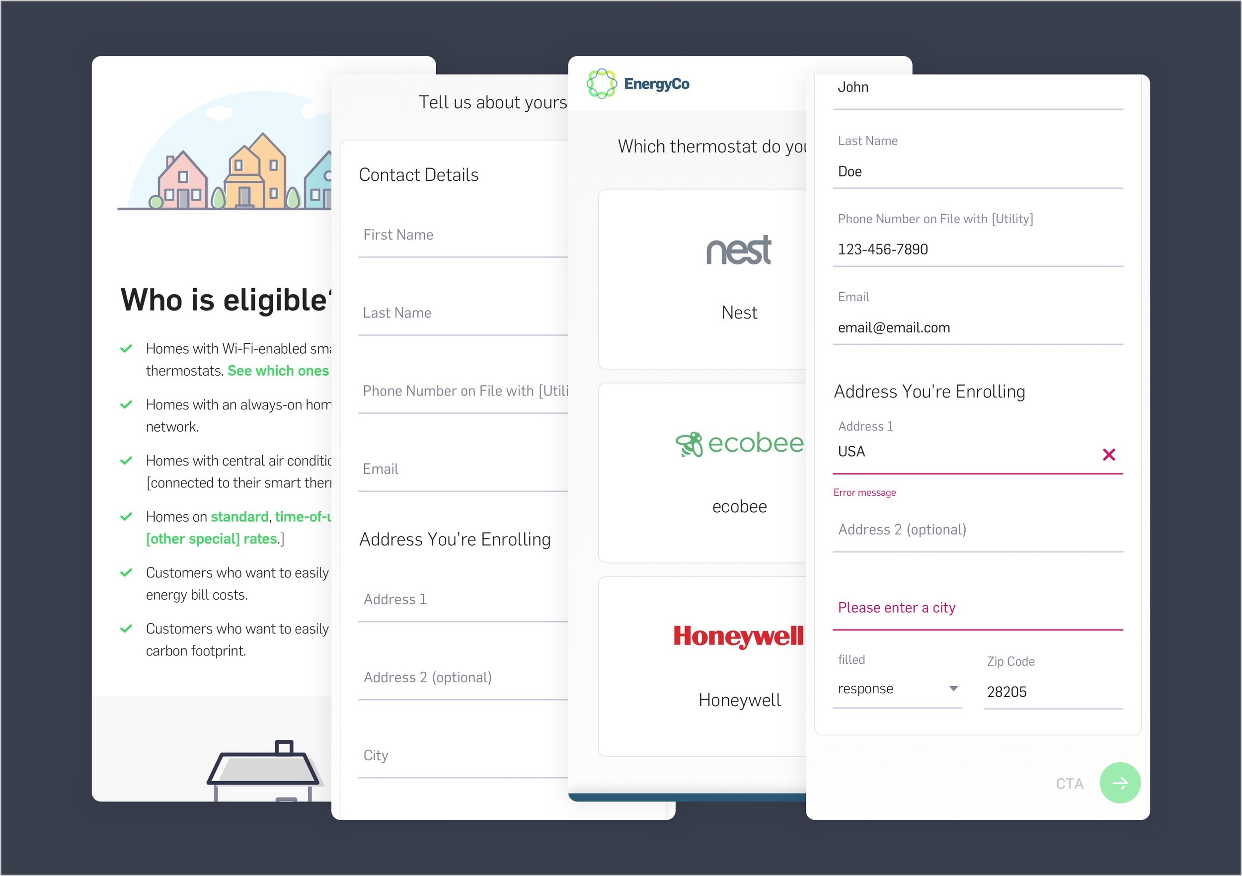
The form UI was a collaboration between myself and a UI designer
Outcome
My role on this project ended in April of 2019 when I left Tendril. However, throughout the course of this project’s lifespan, we only continued to see improvements in our numbers, with one exception. Abandon rate was high when users reached the step where they were redirected to their smart thermostat account. This has and will likely always be a pain point as long as this remains a technical requirement. Regardless, we were still able to substantially increase conversions with better qualified leads.